Johannes Breyer – Bingo
A fresh new font by Johannes Breyer! Crap is good did an interview with him a while ago, right here. And who better to explain his new font then Johannes himself:
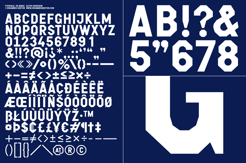
BINGO is my interpretation of a couple of old squared letters I came across and developed further with the help of conceptual-typedesign-heavyweights NORM. Having its roots somewhere in the dustfields of american woodtype, BINGO comes up with another detail unusual to the ordinary college-style: a simple squared outside is combined with a polygon-inside shape, that still appears rounded at small size.