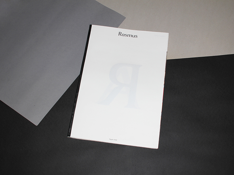
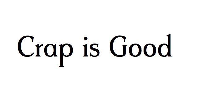
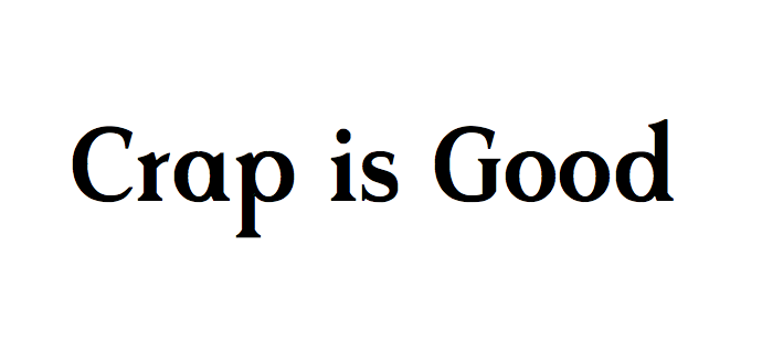
Rasmus – Typeface
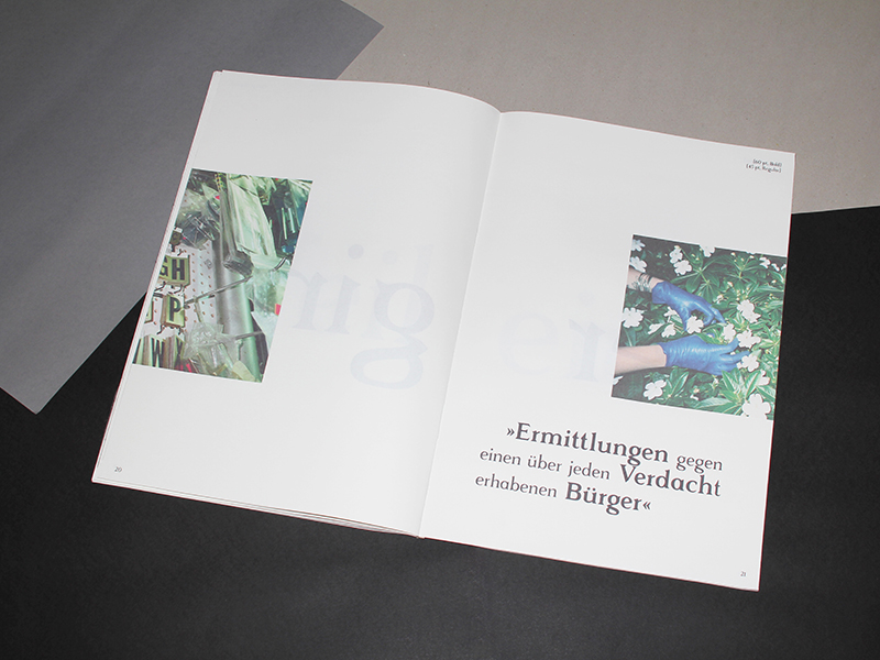
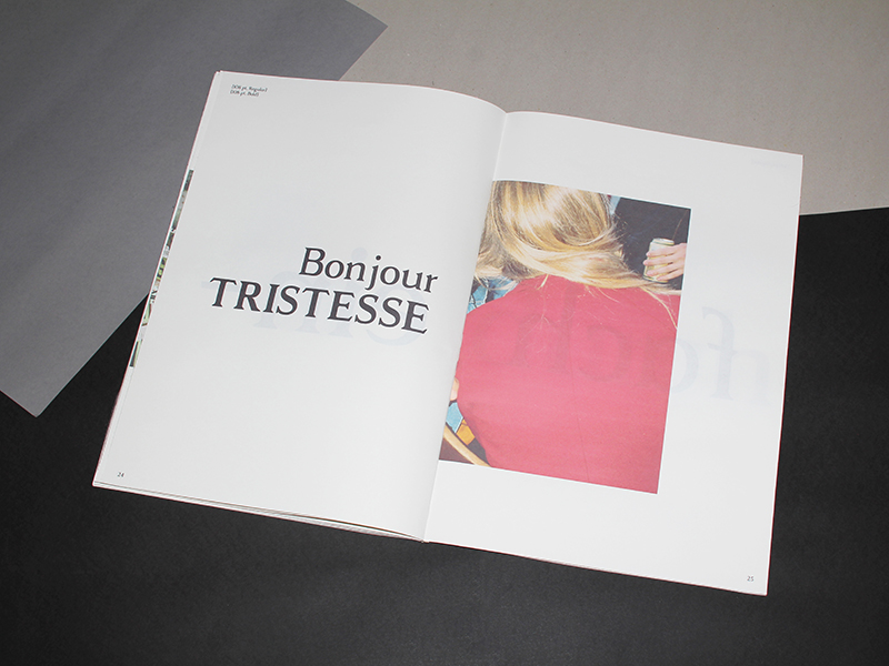
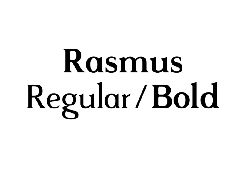
Rasmus typeface was created in 2014 by Markus John after the first typeface Tilde. Rasmus exists as a regular and bold version. The typeface is based on classic serif fonts like Times or Sabon paired with contemporary details. One significant detail is the oblique serifs and edges. The bold version has a larger x-hight and therefore becomes more equal. Both styles work well for running text and titles, although I feel it is more in its element as headline.
Rasmus is the continuation and male counterpart of Tilde. It symbolizes a strong but detailed aesthetic.
And the great part of the story, its only 15 Euros and comes with a free magazine!